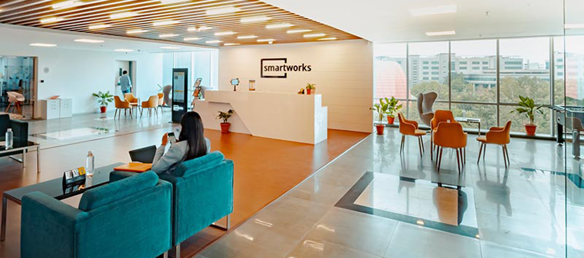
Whether it’s a calming shade of blue or an energising red, moods can be influenced by any number of colour combinations. Consciously, you may not always appreciate the effect of colour in a given space. But subconsciously, your brain is always processing its surroundings and making judgements based on numerous factors. Colours can also be used to associate with different industries. There is a reason a majority of fast-food chains borrow the same yellow and red that we all know from McDonald’s. Your brand may need a specific colour palette to highlight its products and/or services, or to invoke certain emotions in customers to promote engagement with the business.
Think About The Purpose Of The Space
The purpose of the space is important to consider. What are you trying to achieve with the space? Is it an entranceway, waiting room, office, meeting room? Different colours in different spaces can be used to invoke different moods and mind frames. It is possible to create a welcoming entranceway by utilising brand colours effectively. People naturally make connections and associations to aid in comfort and familiarity. People entering your space likely know your brand and painting the space in your brand colours encourage familiarity by matching peoples’ expectations of the space.
Dark colours can make a space feel smaller than it is. This can be used to your advantage if utilised properly. Otherwise, you may be creating a space that feels cluttered or enclosed and thus overwhelming. Similarly, white and pastels can be used to brighten a space and make it feel open. A key factor to consider is the lighting of the space as this will change how the colour of the room is perceived.
Does Natural Light Play A Factor?
Light will determine the ability of the space to use certain colours effectively. Poorly lit spaces may benefit from lighter colours to feel brighter. Other areas with an overabundance of natural light can use darker tones to diffuse the light and feel more welcoming. Colours will vary depending on the amount of light so utilising a uniform brand colour may create different effects in different spaces. Natural lighting at different times of the day is important to consider, as is artificial lighting if the space is to be used outside of daylight hours.
Consider The Impact Of The Colour
There are different models that can be used to consider the emotions that colours invoke. A general rule is
- Red – Passionate, aggressive, important
- Orange – Playful, energetic, cheap
- Yellow – Happy, friendly, warning
- Green – Natural, stable, prosperous
- Blue – Serene, trustworthy, inviting
- Purple – Luxurious, mysterious, romantic
- Pink – Feminine, young, innocent
- Brown – Earthy, sturdy, rustic
- Black – Powerful, sophisticated, edgy
- White – Clean, virtuous, healthy
- Grey – Neutral, formal, gloomy
- Beige – Accentuates surrounding colours
Need A New Look For The Office? Contact McAuliffe Painting Today!
When considering the combined effect of paint colours, natural light and the purpose of your space, you need to make a decision that could affect your business for years to come. At McAuliffe Painting, we have extensive experience with colour in commercial spaces and can advise you on the best approach for your workplace. With endless combinations and variations available, professional advice colour schemes that bring out the best in your people and customers is invaluable. Get in touch with us today to arrange your free consultation.


